A new day, a new dawn, a fresh corporate identity
By joining the Worldline family, OPP has ushered into a new era. As we’ve grown rapidly and are crossing borders to other markets, we felt it was appropriate to reflect this new era and energy in our brand as well. I’m excited to share our fresh corporate identity!
Let me take you on a little journey leading to the refreshed branding of OPP. Founded in 2012 OPP has grown from a small, local but very innovative start-up to a scale-up with proven technology backed by a global payment leader which will help us scale faster and realize our worldwide ambitions. Thanks to our technology and our partners like Marktplaats, Nature.house, Kleinanzeigen, Royal FloraHolland, Gumtree and many others, we’ve become the authority and European leader in platform payments. We wanted a new visual brand that reflects that.
Playful, innovative and fun
Although we’re grown up and part of a bigger organization, it doesn't mean we’re letting go of our innovative, creative, playful and fun culture. These traits are found within our DNA, are our strength and are incremental to the expansion of our leadership position in our market. We remain the familiar, trustworthy, and approachable company you've always known. However, with time, we've matured, gained invaluable experience and crafted innovative solutions we're eager to share with partners worldwide.
Design based on perpetual flow
Our new logo, website and our new user interfaces are designed by the incredibly creative designers from Square One. Their design is based on a perpetual flow depicting OPP as an endless highway that guides our users on a path to various secure and flexible payment solutions. The smooth lines of the rainbow are a visual metaphor of what we do: transferring positive energy (money) in flexible ways and guaranteeing safe payment journeys for our users.
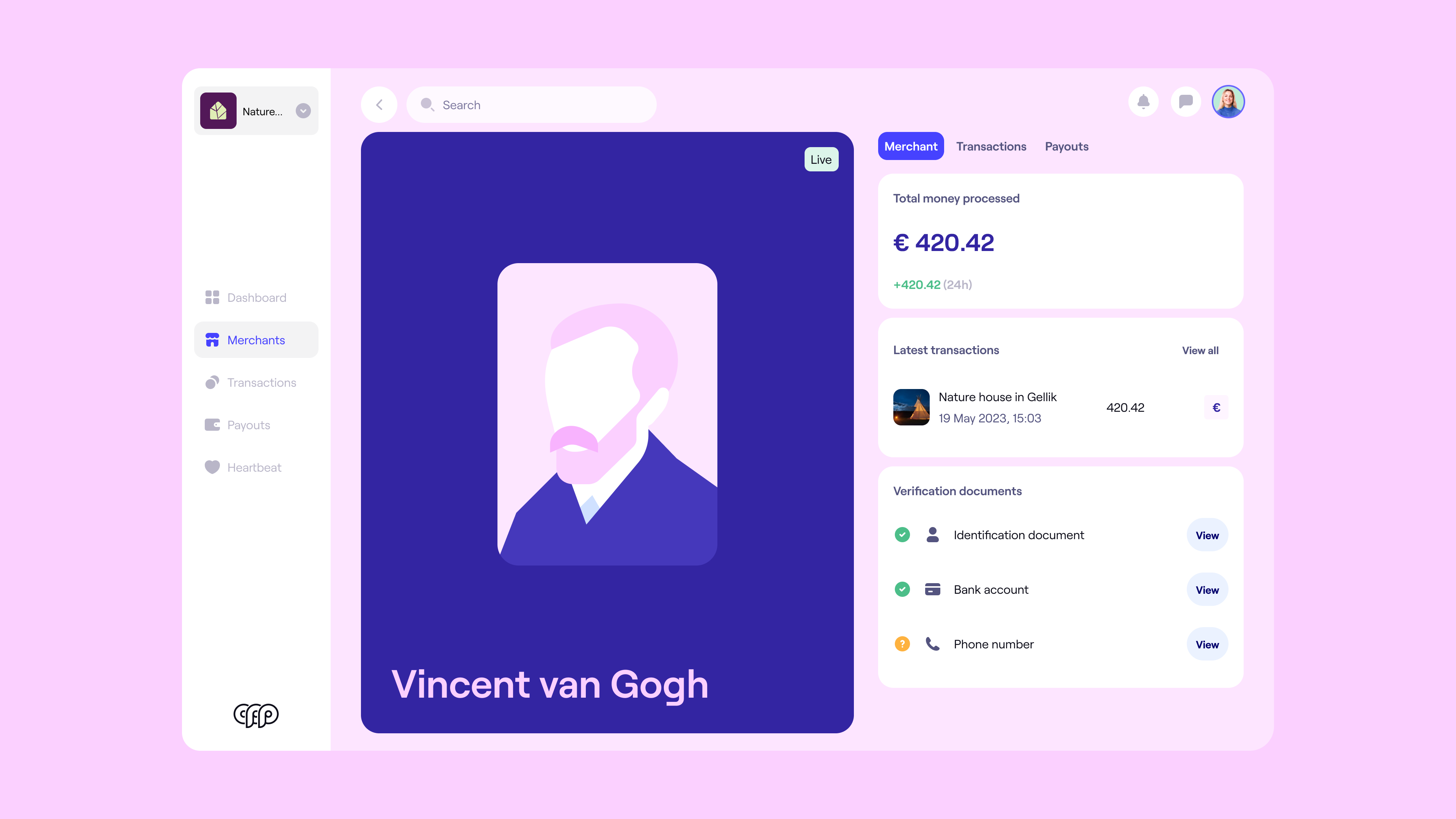
Redesign of all of our products
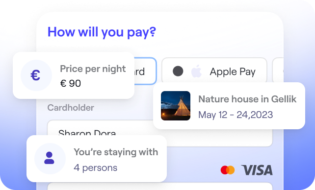
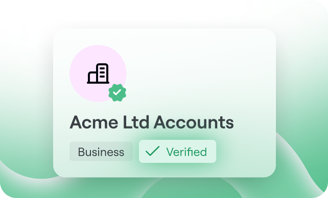
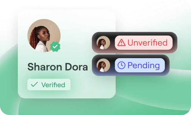
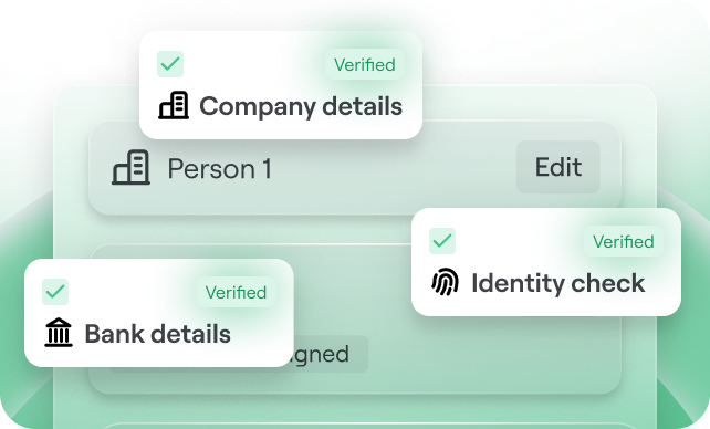
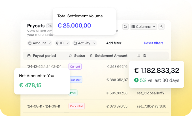
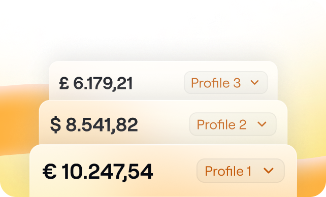
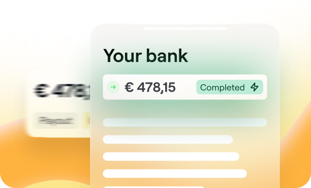
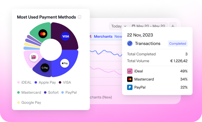
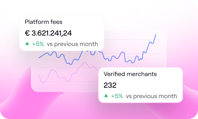
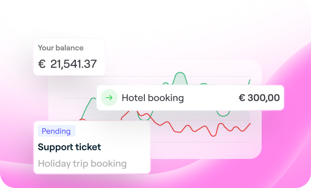
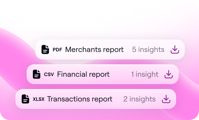
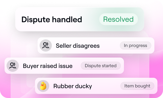
We strive to provide all of our customers with the best possible experience, therefore we’re not just renewing our visual identity, but we are also gradually transforming our various interfaces and touchpoints. Therefore, we’re revamping our products including Partner interface, Merchant Interface, Onboarding and Checkout. This allows us to make an evolutionary leap and to ensure the best user experience for all.
Attractive animations
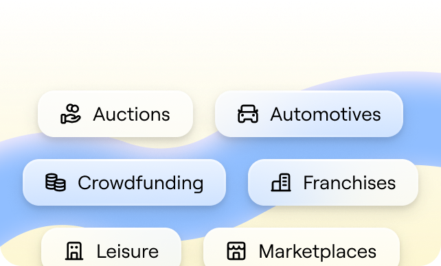
Last but not least, we launched our redesigned website which serves as a hub of inspiration, tailored to better meet the needs of our visitors. Engaging animations and compelling storytelling provide an enhanced joyful user experience while showing our love for the people, art and cultures we’ve been inspired by throughout our lives. We've also crafted dedicated pages for each product, functionality and vertical market we cater to, including franchises, marketplaces, crowdfunding, and auctions, ensuring visitors quickly find the content most relevant to them.
Needless to say, I’m proud and very enthusiastic about our new look! What do you think?
Engulf yourself in OPP’s design
The team of designers has created a special page dedicated to OPP’s fresh brand and design. We love it, you too? Visit OPP.design

.svg)

.svg)
.svg)
.svg)




%20(1).png?width=1300&name=Copy%20of%20Copy%20of%20Blog%20post%20(1620%20x%201080%20px)%20(1).png)


.png)
.png?width=75&height=51&name=Worldline%20(2).png)